
A logo is a visual representation of a company’s brand identity. It’s a powerful tool that can communicate a company’s values, personality, and mission. A great logo can help a company stand out in a crowded marketplace and make a lasting impression on its customers. In this article, we’ll discuss the key steps involved in creating a company logo.
If you don’t have any experience with designing and dont want to design a logo yourself, it is possible to contact a designer.I’d advise you to avoid using crowdsourcing sites like 99designs and such. Don’t get me wrong, some of them have some great designers; you’ll get something great looking but might not be something that goes well with your company and can be a bit too generic. Get someone who you can go one-to-one with and tell him what you have in mind. He’ll do the rest.
Go to your local university/designs school and look for graphic design students (at least in their second year) and ask them if they could help you with your tight budget. If you‘re lucky someone will bite. They will outperform any of the „designers“ on those sites, because they won‘t just spend 2 minutes with your brief and then throw you a stock logo. Entrepreneurs (and most people in general) aren’t very good at evaluating what’s a good logo or not, but everyone recognizes something timeless when they see it.
However no designer will ever put as much work, effort and heart into creating a logo as you will and the best logos are often the ones you draw yourself. The rest of the article will focus on the steps to creating a good logo.
1. Start With You Story
Companies are created to make money — it’s not the most poetic statement, but it’s the one you need to start with. And in order to make a profitable business, you need to be able to sell yourself just as well as your product. Marketers today tend to agree that buyers connect much more strongly to stories than they do to the basic facts of your product. What does this mean to you? There needs to be some story in your logo.

Take note: most of your audiences don’t know your brand. So you should create one that would make them “Oh, so that’s what the business is all about”.Also, create one that could at least have both the company’s name and the symbol itself. That way, even if people would see your company’s symbol, they would be able to recognize it and correlate it with the name.
Before you even think about what this logo will look like, take some time asking yourself what the story behind your company is. When we look at Coca-Cola, we don’t see a brown, carbonated beverage — we see polar bears and thick, white script letters.
Step outside of what your company does and convey why you do it. That “why” is the root of your story, and it should come through in the color, shape, and typeface of your logo. If your logo were the title of a movie, what would it look like?
2.Brainstorm Words That Describe Your Brand
Now that you have your story, it’s time to take your logo draft from story to setting. Open Thesaurus.com and enter a term that best describes your product into the search bar.
For example, if you’re in the clothing industry, you might simply type in “clothing.” You’d be surprised by how descriptive the synonyms are that appear. You can even click these results to start new searches and dig deeper as you zero in on the words that best capture your brand.
Find five to 10 words that describe not only what you do, but the why from the previous step. Each of these words can fit like pieces in a puzzle and help guide you to refining a concept.

What is it? A mind map is a visual diagram with associations related to the company you work with. You take its name & write everything you have in mind about it on paper, album, graphic tablet & so on.
For example, there is a company called Shark Logistics. I divided the name into two main associative groups: Shark & Logistic. After I started coming up with the thoughts related to both items.
3.Sketch Ideas Based on These Words
Armed with your why and a few keywords for direction, grab a pencil and paper and start sketching every idea that comes into your head. Allow each new concept to evolve on its own. Don’t get frustrated if the first few aren’t right — keep refining, using previous sketches to influence the outcome of new ones. You might focus these sketches on a shape, the name of your brand, or both.
As you’re sketching the concepts for your logo, keep these tips in mind:
Keep the shape simple. If you can sketch the most symbolic components in seven seconds or less, you’re in good shape. You should absolutely avoid any popular clip-art artwork or generic symbols like a globe, star, or similar icons that people too easily identify from other places. These are easily forgotten at first glance. The more creative you are at this stage, the better your final logo. Your logo is what your consumers will remember the most. Be honest in this artwork.
Colors can either be your best friend or your worst enemy. You need to include color with your logo, but be selective on which colors you use. Be mindful of current color trends already being used today and in your target market. As a general rule, don’t choose more than three colors. Choose a color or group of colors that will make you stand out from your competition. But please, for the love of marketing, don’t use the whole rainbow!

After that, you draw icons that define the associations. You can take them from your imagination, or the internet (no one forbade it).
I think the icons drawing example is shown clearly in the picture. The only note: if you can’t draw icons well, don’t worry! The most important is their existence, not appearance.

You combine the icons to create an unusual & unique logo shape. You can unit letters, icons with shapes, icons + letters, shapes + icons + letters… in brief, you create a logo design that has its highlight & originality.
4. Test Your Top Sketches With Your Buyer Persona
Once you’ve got a handful of different sketches on paper, take a step back and pick the top three concepts. Don’t think too hard about this — consider the designs your eyes keep going back to, and select them to show to others.
Share these drafts with your friends, family members, and a colleague you trust. If possible, bring these sketches to someone who best fits your buyer persona — or your ideal customer profile. This gives you the most productive opinion on your artwork because it can indicate how customers will receive your brand — not just the people close to you.
Be prepared for honest feedback and don’t take any negative comments personally. These criticisms will only make your final logo better. Use their feedback to select one final concept to develop into a design.
5. Refine Your Chosen Sketch
Congratulations, you’re well on your way to having an awesome logo! Once you’ve identified a sketch to run with, it’s time to refine it and perfect the story you started with in Step 1.
To begin refining your logo, look back at the terms you identified when you first used Thesaurus.com in Step 2. Now look at your chosen sketch and ask yourself: Which terms does this sketch not yet capture? Use them to develop your sketch further, and add back the traits you liked best about the designs you didn’t end up choosing for refinement.
Now that my rough has been cleaned and edited on paper I then finalize my drawing with ink. I then accurately draw over every line and color in every stroke width that needs to be correct. Micron pens are perfect for this job, their ink is nice and dark and they’re not too expensive. I make sure that every element color is nice and dark, the darker the better. It makes the next step even easier.
6. Develop Your Logo’s Layout on a Free Design Platform
Now, it’s time to get technical and turn your paper drawing into a usable digital format. To bring this design to life, you have many free design platforms available to recreate your sketch in digital format. Here are a few free solutions:
Logo Crisp
Looka
DesignMantic
GraphicSprings
The platforms above can help you put your sketched logo in digital format, but bringing your concept to life for a business audience requires a bit of technical direction. One of the most important things to get right is the layout. Make sure all of your text and shapes are perfectly spaced and the logo itself is aligned with its surroundings.

Your logo doesn’t have to be symmetrical, but it should be aligned in different contexts. Chances are, you will encounter situations when your logo sits against different vertical and horizontal borders, and it should appear even with these surroundings no matter how you might repurpose your logo and where you might publish it.
As Logo is required to fit in any sizes, it must be scalable so regardless of the software used you need to keep your logo vector based rather than pixel based. So it is better to use a vector based software like Adobe Illustrator or Corel Draw.(Personal advice: If you don’t know basics of these professional tools, don’t worry about it you can use Microsoft PowerPoint/Paintbrush to digitize your logo from scratch, after that you can render it using professional tool ). For any kind of learning don’t forget YouTube is your best friend!
7. Pick Versatile Colour Options
Your logo’s colour scheme might look great against the colour of the canvas on which you designed it, but eventually, your logo will be placed on backgrounds whose colours you didn’t start with.
Always be sure to have logo color variations for both dark and light backgrounds. That might mean only having to change the color of your font. Or, in some cases, you might have to change the color of your entire logo.
Create one of each option to make sure you’re prepared when ordering promotional products that will display your logo. T-shirts, stickers, notepads, and coffee mugs are just a few of the many items for which you’ll have different colour variations of your logo.
8. Choose a Font
This is the time to combine text with imagery. If you’re chosen sketch is primarily a shape or symbol, rather than text, begin to factor in the written name of your company. Consider the typeface this text will carry if your company name ever stands on its own without the symbol.
Believe it or not, your font choice can say a lot about your business. You can choose a font that’s either serif (with stems on each letter) or sans serif (no stems) — also known as classic or modern, respectively.
Stay away from generic fonts that come standard on every word processor. Some examples of generic fonts are Times New Roman, Lucida Handwriting, and Comic Sans. These fonts will only work against you and your company by making you less memorable.
9. Ensure Scalability
Logos are meant to represent your company on multiple platforms — in print, on your website, on each of your social media business pages, and across the internet as your business grows. You want a logo that can be blown up super large for a billboard, but also scaled down for screening onto the side of a pen.
Every part of your logo should be legible, regardless of the logo’s size.
Whew — still with us? We know this might seem a little overwhelming, but take it slow and don’t rush yourself. It’s better to follow the process through to completion and end with a remarkable brand than to start over a few months later due to a design error or change of heart.
Once you’ve completed your logo, how can you tell if you scored a winner? Easy: Use our Logo Grader to assess the sustainability and effectiveness of your new logo. https://brandmark.io/logo-rank/
Key Elements Of a Good Logo
A good logo should illustrate:
- Who the company is
- What it stands for
- The type of business it is
- What is being offered to a customer in terms of products or services?
It should also be:
- Simple
- Memorable
- Timeless
- Versatile
- Appropriate
- Enduring
Examples Of Famous Logos And What You Can Learn From Them.
Nike
Nike’s swoosh, designed by Carolyn Davidson, is one of the most iconic logos in the world, literally.
The swoosh mimics the wings of Nike, the goddess of victory in Greek mythology and the company’s namesake. It also looks like a checkmark and signifies getting things done or in other words, “Just do it.” With a fluid silhouette evoking motion and speed, you can, you can see how much space there is to instill brand values into an abstract, minimal design.

McDonalds
The McDonald’s logo, also known as the “Golden Arches”, was inspired by the real golden arches that were part of the fast food chain’s original restaurant design. The logo design brings together the two arches that adorned the restaurant chains and turns it into a lettermark logo, an “M”.
Over its signature red background, the iconic golden arches logo drives the “‘50s drive-in” aesthetic of the chain. It’s an image that’s synchronous with the McDonalds brand, because they’ve used it just about everywhere and anywhere. It’s on their packaging, uniforms, physical buildings, adverts—any type of communications that involve McDonalds, involve this logo. The lesson? Be consistent.
Tesla
This now-iconic logo is more than a modern T.
The company that made an undeniable impact on one the largest industries in the world is unsurprisingly futuristic looking and at first glance, just a cool-looking “T”. The company’s founder described the logo as “a cross-section of an electric motor”. Similar to other famous brand logos, Tesla also incorporates the company’s first letter and then infuses it with its branding. The “T” is also designed in a way to evoke an upwards motion powered by electricity and moving towards the future. Small details can add a great deal of meaning to an otherwise static monogram logo.
Starbucks
The inspiration behind the “Starbucks Siren” emblem logo design is very much based in epics and myth-making; the founders chose the name Starbucks based on Moby Dick’s most sensible character, Starbuck.

From then on, they are said to have gone through old marine books to find a mythical creature that they felt represented their company, a siren. These nautical references are also harmonious with the company’s birthplace and the major port city, Seattle.
Incorporating niche characters into a logo gives personality and warmth to the design. It creates a deeper, richer brand persona to help your audiences connect and remember you. It could be a good idea to think about books you’ve read over the years—would any of the characters relate to or symbolize your brand in some way? It might just be one aspect of their personality that your brand shares in its values that you’re looking for. As we see in the Starbucks logo, using cultural references in designs make some of the most memorable logos.
NASA
Nasa’s current, spherical logo, imaginatively coined “the meatball”, was actually their first logo. Fairly literally presenting a planet-like silhouette, the wholesome logo depicts stars and orbits across it in the colors of the American flag.
via NASA
The meatball was replaced by another logo, entitled “the worm”, between 1975-1992. This wordmark logo featured continuous, curvy letters that echo the bodily movements of a worm. Looking at it now, it feels a little retro and Star Wars-esque. Yet, back when it was released, it was considered to be contemporary, minimal and futuristic.
Nasa turned to nostalgia branding, when they made the change back to the meatball, saving the worm design primarily for their rockets. They understand the strong associations that audiences have made with their world-famous logos. The meatball reigned during their most infamous period, with Neil Armstrong wearing the symbol across his chest as he landed on the moon. The brand has monopolized on these positive moments.
WWF
The conservation organization WWF’s logo is truly famous worldwide.
The model for the design was a panda named Chi Chi. The logo design featured her, mainly because she was a recognizable member of an endangered species. They needed a symbol that conveyed their conservation efforts across borders and languages. Another reason was that it was organically black and white.
This pictorial mark shows that using a mascot is smart for a brand wanting to connect with audiences on a deeper level: it’s emotive and an effective storytelling tool.
Coca-Cola
Coca-Cola has had one component of its logo that has always stayed pretty much the same—a flowing, cursive and italicized wordmark with a wave or ribbon-like tail underlining the first ‘C’.
The key here is that the famous logo’s font feels retro, but not dated. They’ve also recen tly brought back the “red disc” logo design, pictured above, to unite the various alternate Coca Cola products—and logos.
The Instagram logo is also its app icon and always was. This doesn’t sound that special since Instagram is and always was an app but the fact that this little symbol of a camera has represented the company through its massive growth is quite significant.
The camera symbol was initially modeled after a Polaroid camera, because the app allowed you to take and share photographs instantly. The logo doesn’t look like it initially did but it still has the shape of a polaroid camera, it’s just a bit more symbolic and a bit less literal. The lesson here, once again, is that a great logo can represent the company’s goal and purpose in one small symbol.
Toblerone
Toblerone’s logo is unforgettable and an example of great branding for several reasons. For starters, it’s a logo inspired by a location. It is made up of a wordmark and a mountain, the Matterhorn to be precise and this very mountain also happens to be the inspiration behind the chocolate’s unique shape: delicious little triangles, tied together as if they are a mountain range.

Shell
Shell showcases the power of word-object association once again. The company’s logo symbol has changed over the years but one thing that has always been there is the image of a single seashell.
The logo is also known as “the pecten” because it is modeled after the Pecten Maximus, a mollusk with a distinctive and large shell. The current design’s contrast between curves and points, primary red and yellow, suggest an art deco influence. Just because you’re in one industry, doesn’t mean you have to find your visual inspiration from it only. Shell didn’t look to garages or oil to find the basis for their logo—think imaginatively.
PlayStation
When PlayStation decided to focus on 3D polygon graphics, it needed a logo to express this shift. Designer Manabu Sakamoto created a logo that held an optical illusion perfect for a gaming brand, an upright “P” and an “S” that lay flat at its feet.
The colors that make up the logo are primary colors red, blue, and yellow; with the green serving as a soft transition in between. With a simple trick of depth that was new and adventurous, the logo helped PlayStation convey the message that this was a brand committed to new technology and a few steps ahead of its rivals. To have a logo that distinguishes a company from competitors, consistent research is key.
Pepsi
Pepsi’s iconic logo, the Pepsi Globe, was at first based on its bottle cap and had red, white and blue colors to channel American patriotism during World War II.
The history of Pepsi’s logo has a lot to do with it having a competing product to Coca-Cola. This is an example of a logo that is successful because it does a great job of distinguishing the brand from its competitors. They initially also had a cursive style wordmark on its logo but later changed into a contemporfary sans-serif to distinguish them from Coca Cola. They kept their spherical symbol to show consumers that they were still the same brand as before, but new and improved, to maintain vital customer trust.
Mercedes-Benz
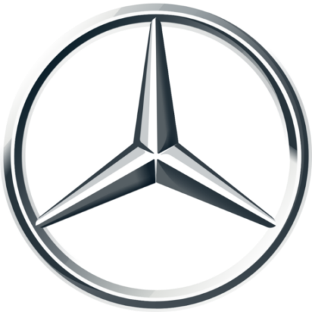
The owners at the time chose Mercedes’s three-point star as their logo symbol because it meant something to them as a family. It was a symbol their late father had used to designate their family home and it was also something that came to mean land, sea and air.
Even though the symbol of a star isn’t something that’s groundbreaking, it’s hard to deny that this isn’t simply a “star”. The Mercedes-Benz star design has very distinct shadings, that gives it dimension and brings its 3d metallic form to mind, with all its angles and glimmers. It’s also enclosed in a circle which all its three points touch, giving the impression that this circle contains everything necessary.
National Geographic
The National Geographic logo looks simple enough but a great deal of market research went into creating it, with having a recognizable, versatile identity was the top priority for design agency Chermayeff & Geismar. And, a thoughtful attention to detail is how they came up with including the magazine’s iconic gold border within the logo, next to the white, all-caps serif.
It is simple enough to go over any background, ideal for the magazine’s legendary photographs and covers. It’s also important to note that as the magazine grew to include subsidiaries, the logo could include an additional word to distinguish them from each other. A logo that isn’t too niche and structurally rigid will hold strong as a brand grows and branches out.
LEGO
The current LEGO has been around since 1998. Its most notable features are its bright red background and the bubbly “LEGO font”, designed for the logo.
The background and the shape are an ode to the building blocks that are the company’s main product; the rounded letters with the black and yellow borders are all very toy-like, squishy and fun.
For a somewhat serious and thoughtful toy, the logo is bright, bubbly and zippy.
BBC
The famous BBC logo is made out of three “blocks” for each letter. The emblem is monochrome, generally black or white and sometimes a tad see-through. This basic structure has quite literally been the building blocks on which the logo saw changes once in a while.
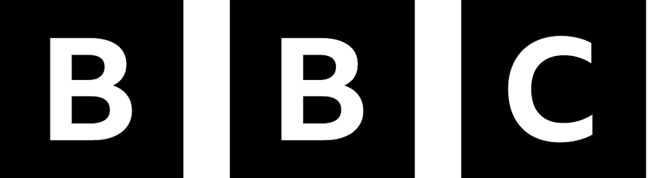
The most significant change was in 2021, when BBC officially introduced their corporate typeface into the logo. It was part of a larger rebranding effort to unite BBC’s various subsidiaries under one font and one aesthetic. Any established institution has to keep consistency in mind when updating their logo. Also by using their own typeface, the company no longer has to pay an annual licensing fee to use a fon
The London Underground
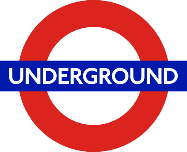
London Underground’s logo, also known as the “roundel”, has been around for over a century. It originated after simplifying the original image of a wheel and created the Johnston Typeface, choosing sans-serif letterforms for optimal legibility.
The logo has alternate color schemes for different stations and modes of transportation, but the red and blue version is the main one. Overall, the minimal symbol is accessible, easy to understand and reliable—everything you would want out of public transportation.
The Olympics
Across the globe, the five rings linked together signify the same thing to a global audience: the world’s bests in sports. The five rings represent the five continents, each with a different color, coming together in movement. And to convey this sense of togetherness, the designer has linked and interweaved its spherical rings.
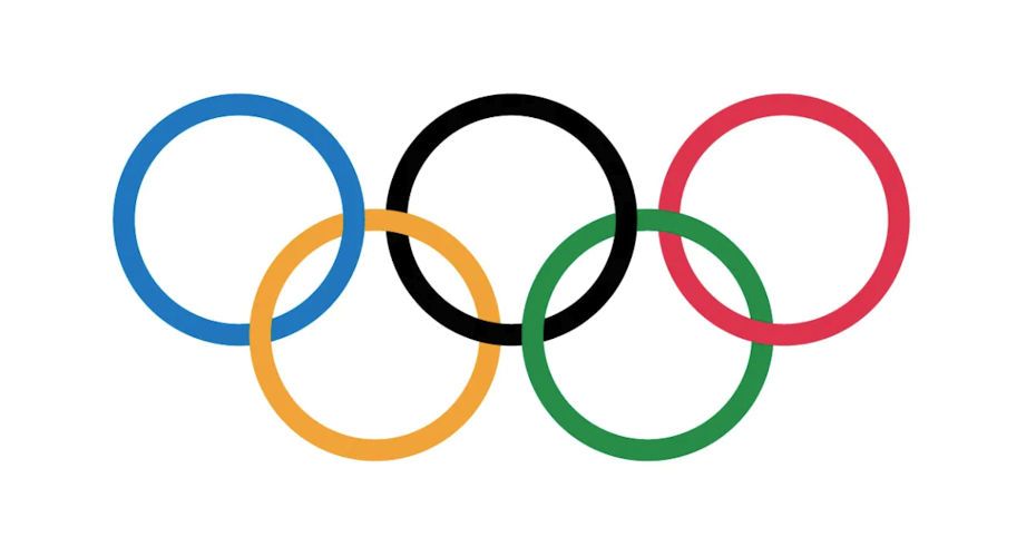
All in all, the Olympics logo is a brilliant example of cross-cultural design, meaning that the designers chose a symbolic logo that would be enjoyed pretty equally across cultures. How do you achieve this? Research your market and ensure the colors, shapes, icons, and figures you use do not represent significant or negative concepts in different culture
Google shared the newest version of its logo in 2015. The goal with the new update was to create a logo that worked with responsive design, it could go onto any screen without compromising its integrity. Since the beginning, the logo has been simplified more and more with each update. It was always the same logo, just increasingly easier on the eyes.
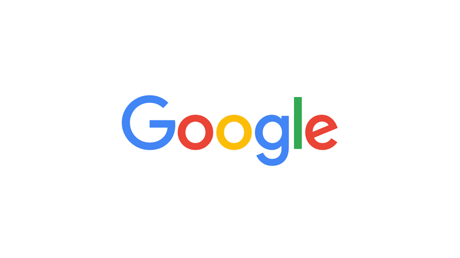
It’s also a logo that lends itself to significant alterations while retaining its basic structure—I’m referring to the Google Doodle. Having a logo that is basic and simple enough leaves a company with a lot of freedom to play around with it according to current events. This dynamism gives the logo (and the company) relevance.
Walt Disney Pictures
The core of the “Walt Disney” wordmark logo is shared across many of the company’s various brands. It’s made up of the founder’s signature but with some calligraphic touches. For example, the “D” of Disney (that looks more like a G to some). The “I” is dotted with what looks like a pretzel. These little touches attract imagination and evoke a sense of magic–perfect for an audience of children and nostalgic adults.
A thoughtfully executed calligraphic wordmark design can have a great deal of personality and humanity. This is useful for companies that want to emphasize their human side, rather than the corporate.
Playboy

At the time it came out, Playboy was the first of its kind in the publishing world. The identity the magazine wanted for itself was sexy, refined and witty. How did a rabbit wearing a bow-tie come to represent that?
The image of a “rabbit” has been used as a sex symbol by humans for more than a millinea, there are even references to its fertility in Classical Antiquity. Take a simplified version of that symbol and give it a bow-tie, you have a classy bunny. The choice of keeping it black and white further gave it a sense of elegance. What the logo says is, “It’s lewd but not trashy.”
While the magazine and its aesthetic saw many changes throughout the decades, this sense of core brand identity remained the same largely thanks to the logo.
Redbull
If you didn’t know, the Red Bull symbol represents work ethic. A bull symbolizes strength, confidence, stability, and stamina. In some countries, the bull symbol can also symbolize fertility, farming, teamwork, and helpfulness. The two bulls also convey the effects of what happens after drinking the beverage.

Formula 1
The original red, black and white Formula One logo, now retired, was designed when the race began to achieve international recognition and notoriety. It was eye-catching and successful for several reasons. This punchy famous logo design is italicized, with the red part is made up of tiny arrows. Why? Because this visible orientation gives the energy of a lurching car. Ideal for the story the brand wants to tell: speed. And if you look closely you will see that the “1” is created by negative space.
Adidas
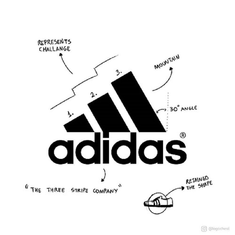
The name of Adidas is derived from the co-founder, Adolf Dassler. Three stripes of the logo symbolize a mountain, which in turn represents the obstacles, challenges and limits that athletes have to overcome.
AUDI
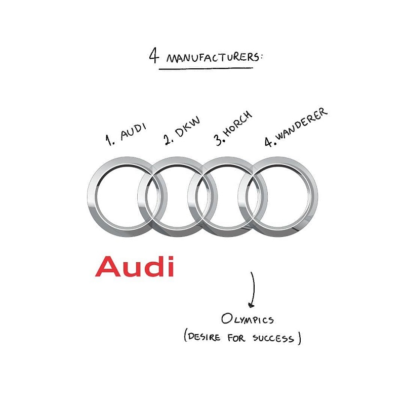
The four ceiling rings of the logo is rather simple to reflect the four automobile manufacturers (Audi, DKW, Horch and Wanderer) of Auto Union.
BMW
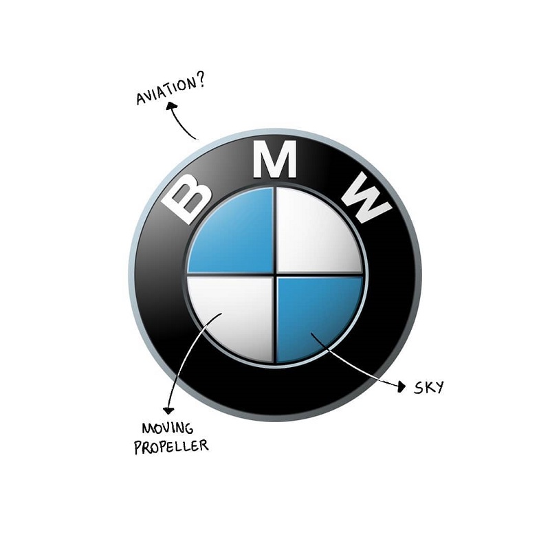
BMW’s logo colours (blue and white) is in fact simply derived from the Bavarian flag, the city where BMW originated. The logo symbolizes the blades of a spinning propeller, in line with the aviation history in 1920s.
LG
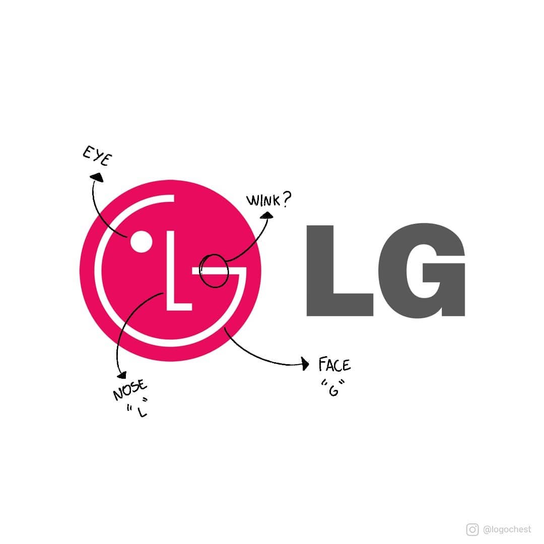
At first glance, you might think that the LG logo is nothing special. However, there is a little detail where the letter ‘L’ and ‘G’ are stylized image of a person’s face. The ‘L’ abstracts the nose and the ‘G’ abstracts the rest of the face, giving the brand a human touch
TOYOTA
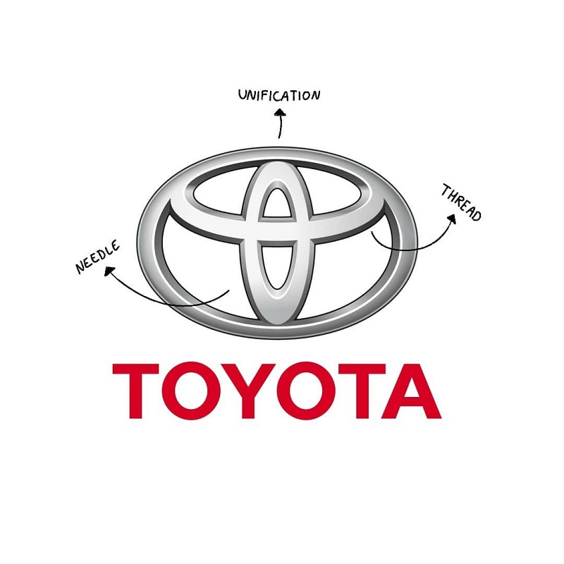
Toyota’s current logo represents an image of the eye of a needle with a thread passed through it, in line with the past history of the company which used to produce weaving machines. The logo is somewhat of a stylized “T” within a ring, form an overlapping of three eclipses/rings. The three eclipses symbolizing three hearts represents the unification of the hearts of customers and the company’s products.
Boeing
The symbol of Boeing is an abstract geometric image, created by Rick Eiber in 1997. The emblem depicts a flat ring, standing for the globe, a bold sharp arched line, representing an orbit, and a triangular tick, showing the main specialization of the company — a plane
Lockheed Martin
The pursuit of the stars for the good and protection of their country can be seen in the Lockheed Martin logo. Paving the way to heaven is not easy. The emblem shows the touch of new beginnings and innovations that help the company maintain its leading position in this market.

Space X
The extended ‘X’ in SpaceX’s logo symbolises a rocket’s trajectory.
Solar City
SolarCity’s logo includes a sun graphic, representing the power source for the company’s solar panels. Oter competitors in the Solar market build their logos on similar themes
Target
The Target logo conveys its goals clearly, with the brand aiming to provide precisely what the customer wants and needs.

So looking back, can you see patterns in how these famous logos get it right?
There are several common threads. Almost all of these famous logos have their own unique typeface. They are smart with color and use of negative space. They favor simplicity over something that is convoluted, this is especially clear when viewing a logo’s evolution.
But the most important lesson is to figure out who you are. Once you have that, you can boil it down to an uncomplicated and replicable symbol, the trick is recognizing its power.
.